Blog
Breaking the Norm
A Curated Identity for LOSMP

Designing to be bold is a subtle art. It’s about being intentional – to build something that challenges assumptions. And that’s exactly what we did for LOSMP.
This small but mighty law firm counsels emerging and disruptive businesses. The firm’s clients are focused on changing the game, and don’t get caught up in doing “business as usual.” Likewise, LOSMP – a name derived from the Law Offices of Shane M. Popp – disrupts the typical approach to intellectual property law: the firm is nimble, using a “direct to consumer” process that eliminates the stodginess largely found in the legal industry. They needed a brand to match, and we made LOSMP look and feel like the nimble, modern practice it is - because that’s how the firm’s clients see themselves.
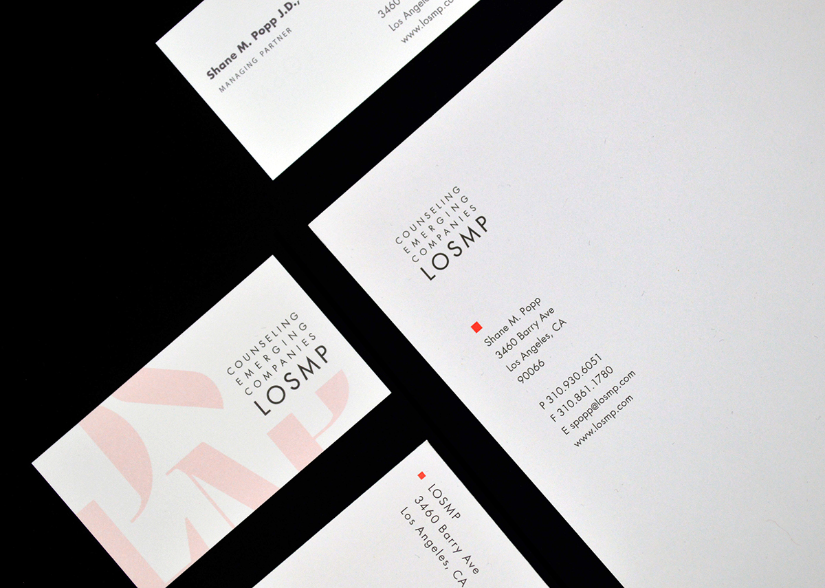
From the get-go, our designers started with bold inspiration. We knew that first impressions and clear messaging were key for LOSMP – they needed to resonate more like the disruptive clients they serve than the big, antiquated firms they compete against. So, we threw out the norms of how a legal firm can look. The result is a dynamic new representation of LOSMP through a cohesive identity system and website. The look is modern, fresh and scalable – working seamlessly for both a solo show or a growing team in the future. It resonates like a cutting-edge, focused business – not like a traditional legal firm. And it’s palpable; standing out on the web and on paper.

It’s not just lip service. Beyond inherently standing out amongst the sea of beige brands in the legal field, LOSMP’s identity is designed with intention. The burnt orange color was chosen because of it’s rarity in legal services. The logo mark was developed with inspiration from LOSMP’s “four corners” approach to practicing law, with our designers using a simple square as the foundation for the firm’s mark. The typeface was chosen for it’s ability to resonate across many industries - it’s a serif font with traditional roots, yet possesses unconventional details. And every use of the brand – from business cards to the website – were designed around the ways LOSMP connects with clients for a superior partnership.
Working alongside our friends at Gigantic, we built a website that places the brand front-and-center. Subtle things – like the way the logo is animated to the textures and patterns used – result in a digital experience that’s clear and engaging. Text was intentionally kept minimal, focusing on clear differentiators and mission-driven statements. It presents a powerful understanding of LOSMP’s value proposition, just like a cutting-edge startup or modern tech firm would.

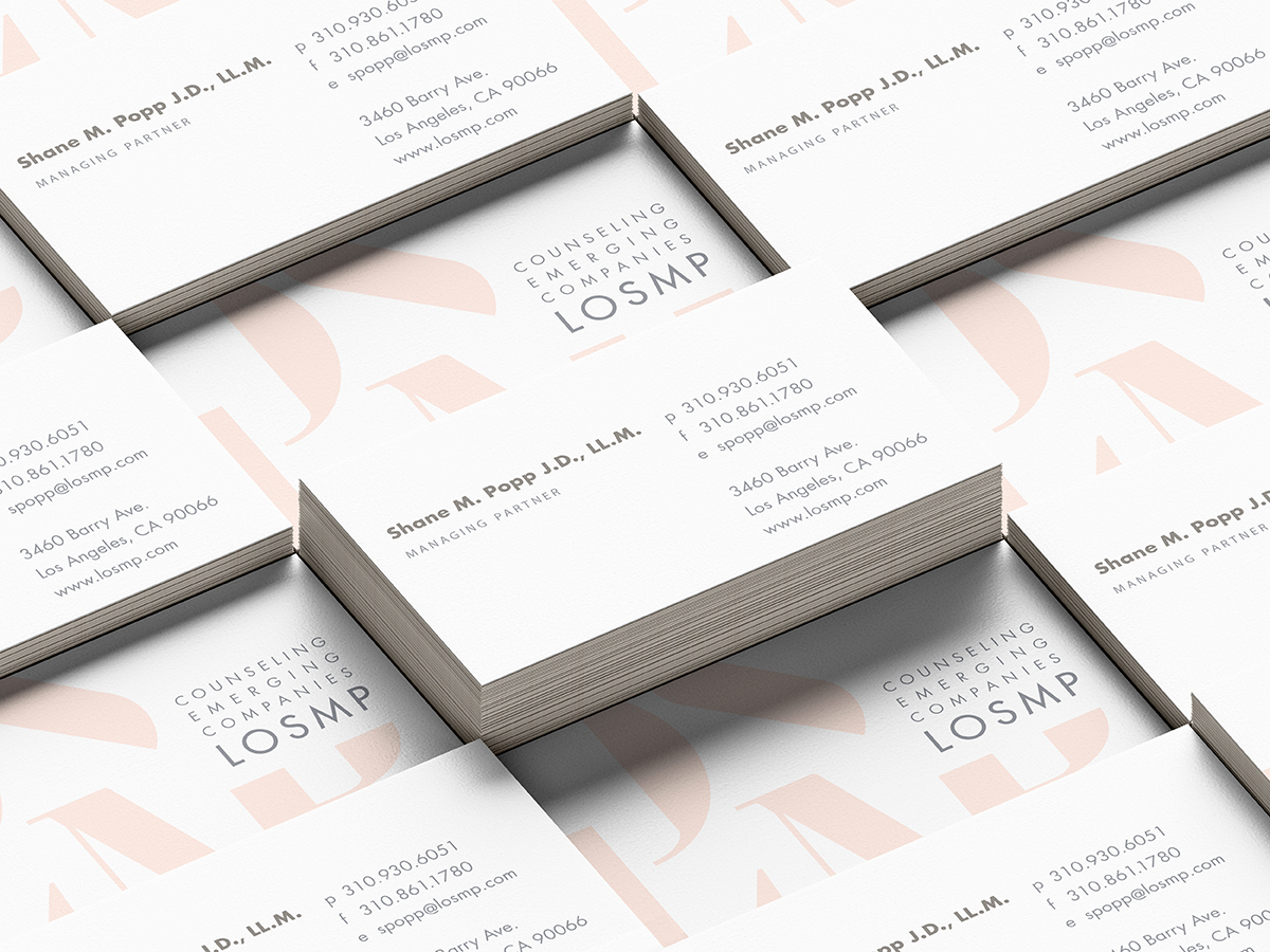
Physical assets, like business cards and client contracts, were also designed to convey LOSMP’s modernity across all touchpoints. We heard from LOSMP that rarely do those in the legal field worry about bold branding on their business card or client contracts, yet felt that it was key to the firm’s ability to reiterate their differences. We scaled the brand across these important elements, ensuring something as small as a business card exchange represents the firm’s different philosophy.

Ultimately, the brand personifies LOSMP in the same vein as their clientele, helping the firm feel like an instant contemporary – and the result has been catalytic. A new client of the firm remarked how LOSMP just seemed like us, with another sharing how they loved the idea of partnering with a firm that looked like the type of business they themselves want to create. Ultimately, it’s about the connection: LOSMP understood the relationship between a bold identity and the vision of their clients – and they now have a brand articulating that.

Published on 24 March 2022